it's been a long time since I came around...
I just figured out how long it's been since I updated this blog, damn... ALMOST A MONTH! I just hope all of you followers are still there. D;
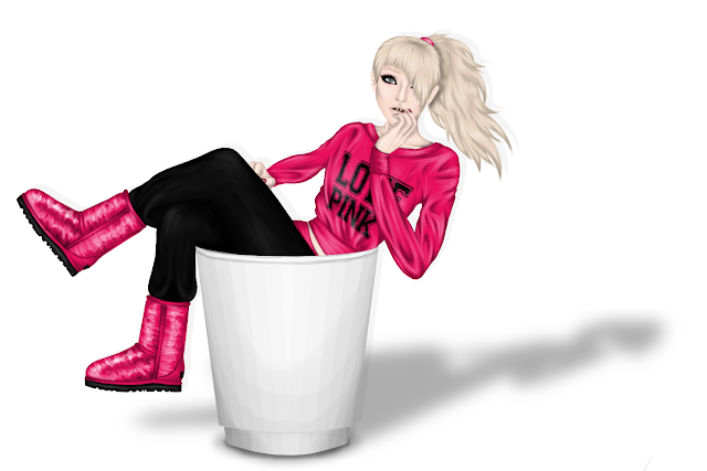
anyways, here's my latest graphic;
Just in case you wanna see it full-size, click on it...it's pretty huge tbh.
The banner graphic was made for somebody who apparently fell in love with yoghurt, I guess you can tell who's that by the medoll...
The uggs are supposed to be glittery, I'm not sure if I got them to look right, but I guess they're fine. Neither I'm sure about the shadow opacity of the sweatshirt's sleeves, in fact it may look okay for you if your computer's graphics card is/isn't as sh*tty as mine. I kinda like the hair and the eye(s)...and you just gotta love the yogurt cup, cause it's really just super epic.
Opinions? Comment please ;)


LOL so cute! Patz is gonna love it! Maybe label the cup so its a tad bit clear, but the idea is quite cute! ;)
ReplyDeletei guess i'll really label the cup because it looks a lot like a trash can lol, thank you for the suggestion. ;p
DeleteI love it :D Uu re very skilled :)
ReplyDeleteikr? i'm SUCH a pedo!!! d238f32bf3....how does sitting in yoghurt make me a pedo? That makes no sense....
ReplyDeleteYOU'RE BACK!
ReplyDeleteThat's amazing, I can't imagine how long you must spend on putting folds into the clothes.
I think the folds are a little exaggerated, but that's only my opinion. It's still amazing!SOOOO much better than anything I could do.
ReplyDeletethey look totes fine for me, except they look a lil bit fake...but i guess they look fine just because my comp lacks in contrast
DeleteA stardoll graphic isn't supposed to look like a picture. Your graphics don't look realistic either...
Deleteits amazing! id say the same as martusia! but its a great comeback!
ReplyDeleteThe only things I would say is that the head is huge - or the neck is too small. Either way, it just looks so out of proportion to me :/ And that yeah, the lighter shading on the sweatshirt is a bit too shiny; other than that, it's amazing! It's seriously brilliant. If I had known what a difference a tablet would make I would have used my now broken one on SD graphics long ago, haha. You've just become so good so quickly!
ReplyDelete*Oh, and, the uggs look fine. I can see the glittery effect, and you can see it even better full size.
It looks so cute, I really like it. But the neck is too small. And the way you draw the belly and that parts closer to it. I don't know if it's ok, but I don't like it too much .
ReplyDeleteGood work btw c:
..Patrick sent me a pose made by someone else, and said that I should use that one, but the pose was pretty "off" so I just kinda shrinked it to a normal body size, I obviously failed at some parts.
DeleteThe hair is amazing.
ReplyDeleteStop pointing out what's wrong and enjoy the damn graphic.
ReplyDeleteOh hey, I didn't know you lived in Connecticut! We both have Macs....sweet!
Deletehttp://i43.tinypic.com/4hyz5g.png
Actually, I live in New York, but my internet is from CT. Yes I have a MacBook Pro. The link didn't work for me?
Deletethat was 7th grade, you know 3 years ago.
ReplyDeleteThis comment has been removed by a blog administrator.
ReplyDeleteThis graphic is AWESOME!!! Just a little too much wrinkles on the t-shirt.
ReplyDeleteeh i see, they made it look ew....
Delete